Second Brain
Second Brain
Product Design
Product Design
Constella 2.0 Redesigning the Platform Into a Calm, Connected Thinking Space
Constella 2.0 set out to fix these gaps and turn the product into a calmer, clearer, more connected thinking system. It introduced a lighter identity, a unified homepage for private and shared canvases, multiple canvases for different projects, tabs for quick switching, deeper integrations, and a mobile direction built around reachability and quick capture. Together, these changes created a platform that feels more structured, more scalable, and much easier to think inside.
Summary
Constella 2.0 restructured the product around clarity and scalability. The redesign brought a calmer visual language, a more predictable workspace model, and deeper integration with tools users rely on every day. Multiple canvases made projects easier to manage, a unified homepage clarified how the system is organized, and a consistent search and Stella model improved discoverability and flow across both web and mobile.
These changes reduced confusion, made key actions easier to understand, and created a stronger foundation for a more intelligent, connected thinking platform.

1. Core Problems With Constella 1.0
Only one endless canvas — no project separation
No integrations with tools like Gmail, Slack, Drive, or Notion
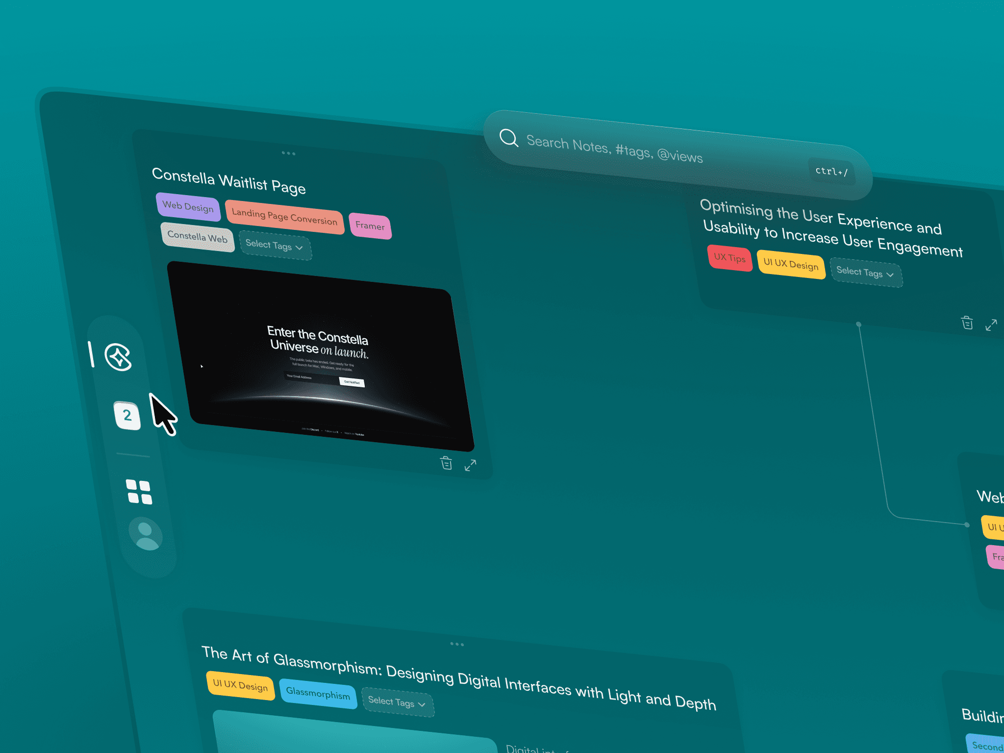
Heavy, saturated visuals with unclear hierarchy
Mobile was a linear notes list, not a spatial companion
Stella felt detached from the actual workspace
1. Core Problems With Constella 1.0
Only one endless canvas — no project separation
No integrations with tools like Gmail, Slack, Drive, or Notion
Heavy, saturated visuals with unclear hierarchy
Mobile was a linear notes list, not a spatial companion
Stella felt detached from the actual workspace
1. Core Problems With Constella 1.0
Only one endless canvas — no project separation
No integrations with tools like Gmail, Slack, Drive, or Notion
Heavy, saturated visuals with unclear hierarchy
Mobile was a linear notes list, not a spatial companion
Stella felt detached from the actual workspace
2. What 2.0 Needed to Achieve
A calm, neutral identity users could focus inside
A scalable structure that supports multiple canvases
A unified homepage showing private canvases, shared canvases, and saved views
Tabs for quick switching between different projects and spaces
Integrations that pull external information directly into the workspace
A unified search model across everything
A more present, contextual Stella
A mobile direction focused on reachability and quick idea capture

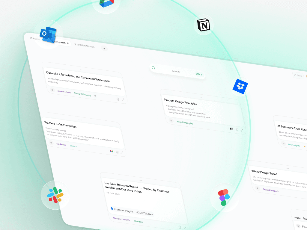
3. Web 2.0 — A More Connected, Scalable Workspace
The web redesign became the core of 2.0, bringing structure and clarity to the platform.
A. Integrations Hub
A dedicated place to connect Gmail, Slack, Drive, Notion, and more.
Clean layout
Clear categories
Simple connection states
Unified search across all integrations
This moved Constella from an isolated canvas into a connected thinking platform.

B. Multiple Canvases
Users could now split their work across separate canvases (similar to Figma files).
Better organization
Clear project boundaries
Easier long-term structure
More scalable mental model
This reduced cognitive load and made Constella feel like a real workspace rather than a single board.
C. Tabs for Project Switching
Tabs made it easy to jump between canvases, research spaces, tasks, or shared work.
Faster navigation
Better multitasking
More predictable system flow

D. Unified Homepage
The homepage now clearly separated:
Private canvases
Shared canvases
Saved views
Integrations
This gave new users an immediate understanding of how the platform is structured.
D. Unified Homepage
The homepage now clearly separated:
Private canvases
Shared canvases
Saved views
Integrations
This gave new users an immediate understanding of how the platform is structured.

E. Stella Panel
Stella moved to a right-side panel with a calmer presence:
Soft gradient
Clean hierarchy
Consistent spacing
Feels integrated, not intrusive
Stella became part of the environment rather than a pop-up.
F. Light, Calm Identity
Constella moved from dark gradients to a light, neutral workspace.
Neutral white surfaces
Softer shadows
Balanced spacing
Clean typography
This made the canvas feel more like a modern, professional tool users could focus inside for long hours.

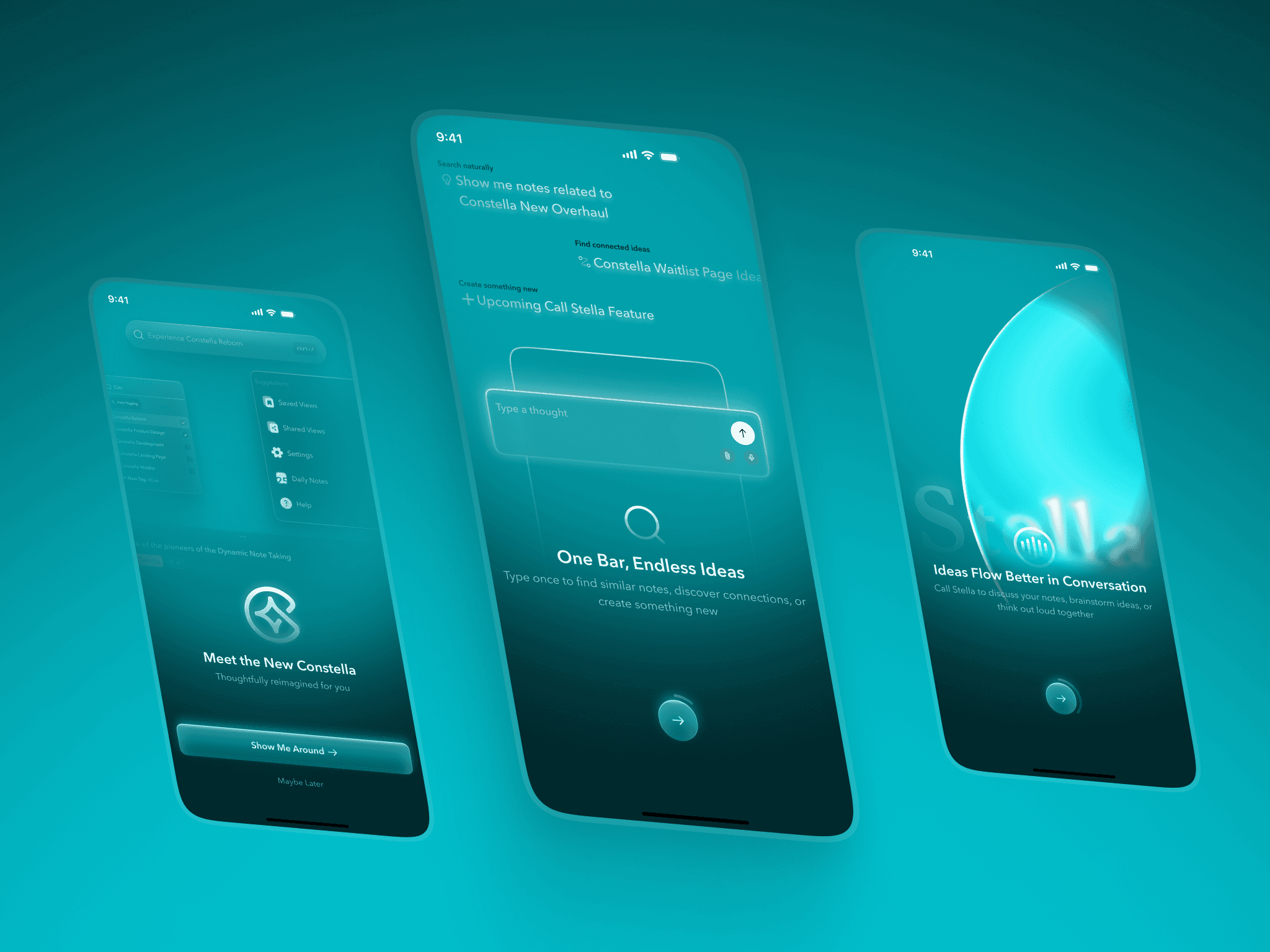
A Softer, More Expressive Direction for the Mobile Experience
Mobile 2.0 explored a softer, more expressive visual direction that made the companion app feel warm, fluid, and welcoming. Instead of directly mirroring the web’s neutral identity, the mobile experience used gentle aurora gradients, subtle depth, and soft glass surfaces to create a more emotional, approachable feel suited for quick capture.
Notes and tasks were redesigned with clearer hierarchy, larger cards, and breathable spacing to improve readability on small screens. Stella became a focused space with a quiet circular orb and simple guidance, making it easier to think or ask questions without feeling overwhelmed.
This direction gave mobile its own personality while still aligning with the product’s core purpose: supporting ideas wherever they appear.
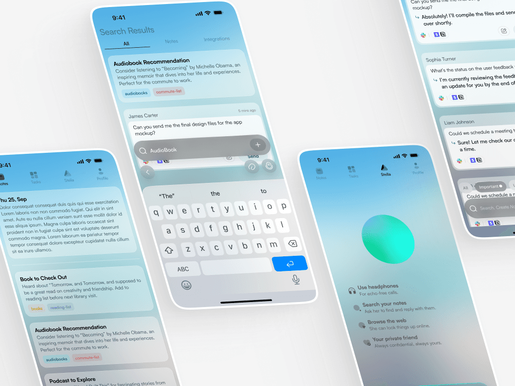
Bringing System Clarity and Reachability to the Mobile App
Even with its distinct visual tone, mobile 2.0 stayed tightly aligned with the platform’s system. The search bar behaved the same way it did on web, with consistent patterns for discovery and note creation. Task and note structures followed the same hierarchy and spacing as desktop, making context switching effortless.
Because mobile is used quickly and often one-handed, reachability shaped the layout. Bottom-aligned actions, quick shortcuts, and a simplified interaction pattern made capturing ideas fast and intuitive. Stella followed the same logic and role as on web, but expressed in a more personal, focused environment.
Together, these decisions ensured mobile felt like a natural extension of the platform — expressive in personality, consistent in function.
Closing Thoughts
Constella 2.0 brought clarity and structure to a product that had outgrown its original shape. The web direction introduced a calm, scalable workspace backed by integrations, multiple canvases, and predictable system flows. Mobile explored a more expressive identity built around reachability and quick capture.
Both platforms now worked together as a unified system, offering a clearer foundation for future AI features and deeper thinking workflows. This project reflects the work I enjoy most: taking a strong product idea, understanding where the experience breaks down, and shaping it into something users can understand, trust, and genuinely think inside.